EverTrek Website
Designing a simpler booking experience for adventure travellers
Client: EverTrek
Responsibilities: Product Design and Illustration
Deliverables: Responsive website and illustrations
Industry: Travel
The Challenge
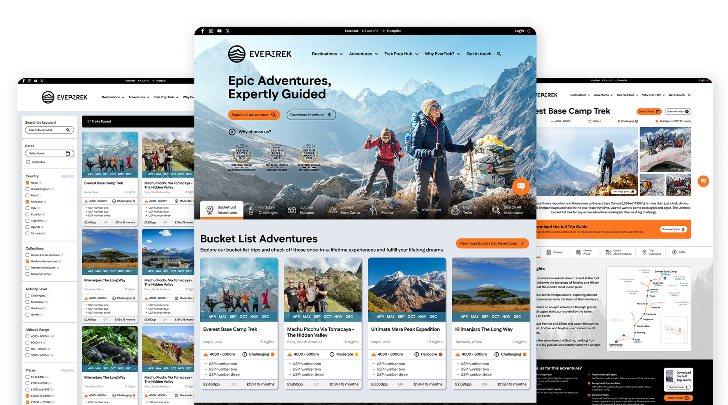
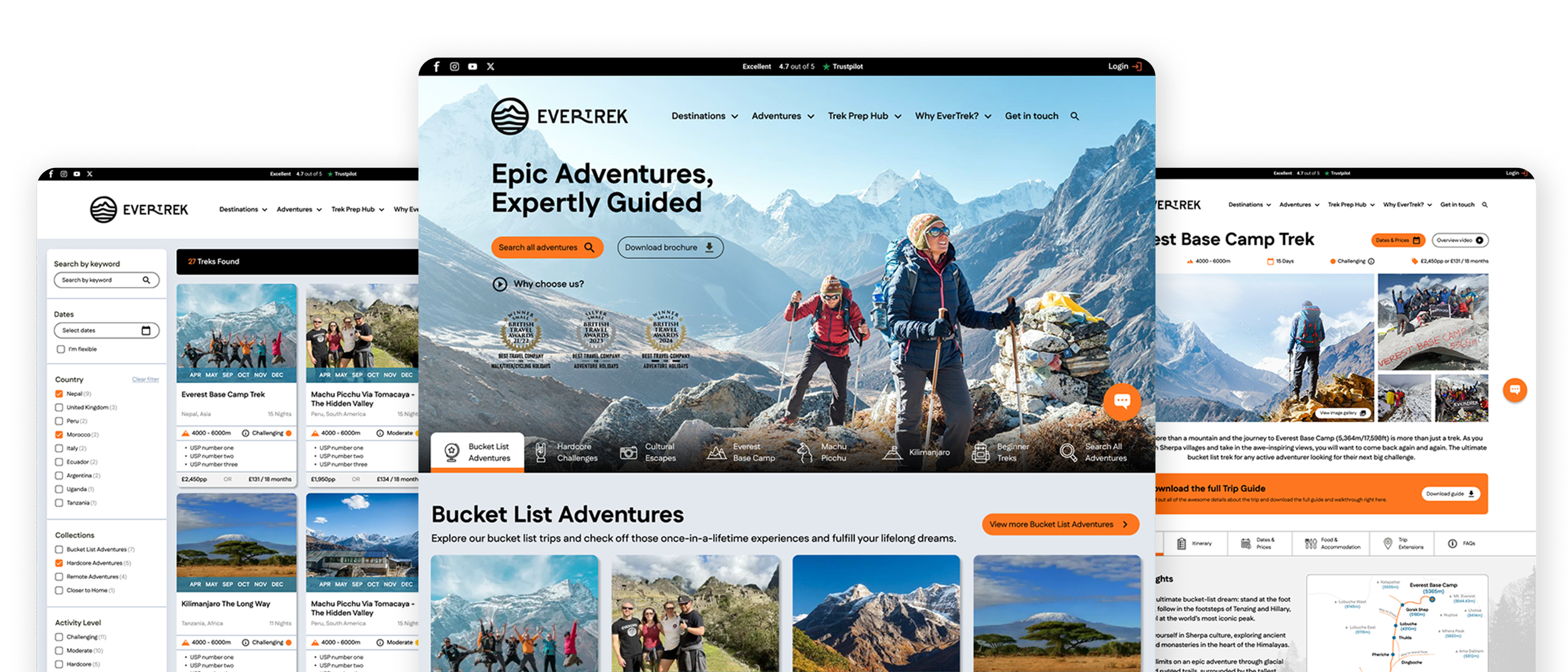
EverTrek wanted to make it easier for customers to discover, compare and book trekking adventures. We redesigned key stages of the customer journey, including the homepage, trip pages and checkout, to improve navigation, surface important information and create a more confident booking experience.
My Approach
Working closely with the client, I focused on the areas of the website that had the biggest impact on the booking journey. The work centred on making complex travel information easier to understand while maintaining the excitement and sense of adventure that defines the EverTrek brand.
Creating a clearer first impression
The homepage was redesigned to make it easier to understand the range of treks available. We simplified the content hierarchy and navigation while keeping the sense of adventure at the heart of the EverTrek brand.
Helping users find the right trek
Search and filtering were designed to make a large range of trips easier to explore. Key details such as destination, duration, altitude and difficulty were surfaced on the trip cards, helping users compare options without having to open every trip.
On smaller screens, filters were moved into a dedicated menu to keep browsing simple without losing details.
Trip page restructure
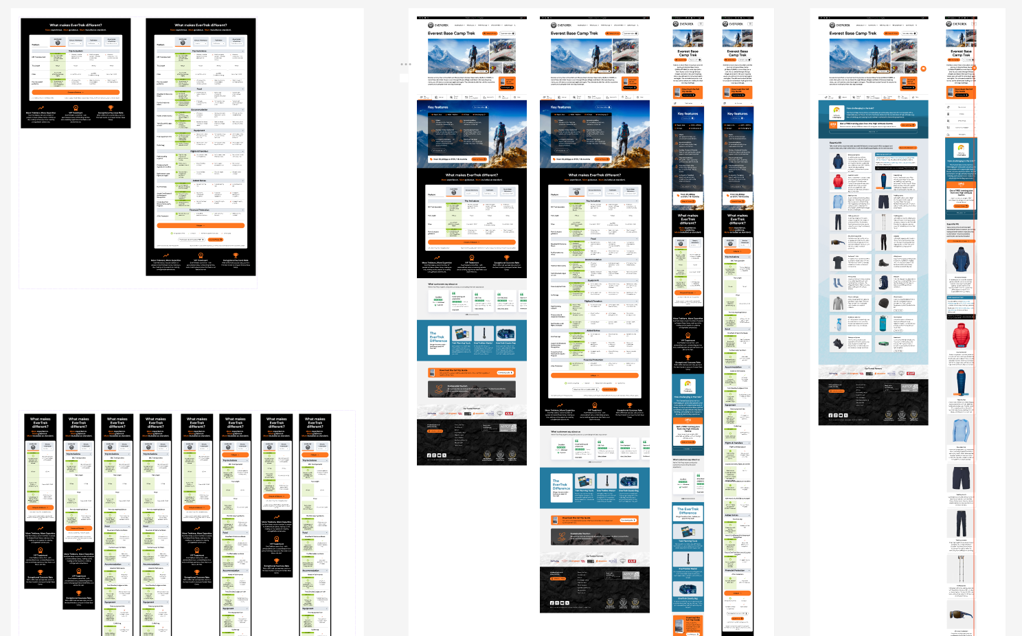
Trip pages brought together inspirational content and the practical information users needed to make a decision. I reworked the hierarchy to surface key details earlier, while organising content such as itineraries, dates, accommodation and FAQs into tabs so it was easy to explore.
Making checkout more straightforward
Once a trek had been chosen, the checkout needed to make the next steps feel clear and manageable. We designed the desktop checkout experience to break the process into straightforward stages, keeping key information visible and reducing unnecessary complexity as users moved towards completing their booking.
The responsive implementation for this was handled during development, with the desktop designs and design system we created providing the basis for the final experience.
Maps, iconography & illustration
Alongside the UI design, I created custom maps and icons to make routes, locations and trip information easier to understand at a glance. They also added some personality to the experience while staying functional and consistent with the wider design.
Outcome
The redesign brought greater clarity and consistency to the journey from discovering an adventure through to booking it, while giving EverTrek a digital experience that better reflected the personality of the brand.