Sonovate App
Designing connected mobile experiences for candidates and clients within a fintech platform.
Client: Sonovate
Responsibilities: UX Design, UI Design, Interaction Design
Deliverables: Native mobile app (iOS & Android)
Industry: Fintech
The Challenge
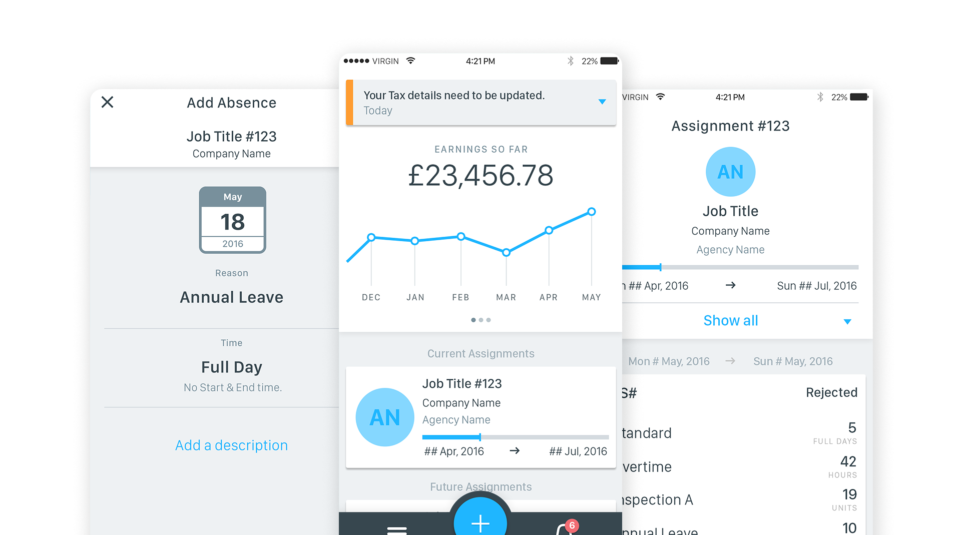
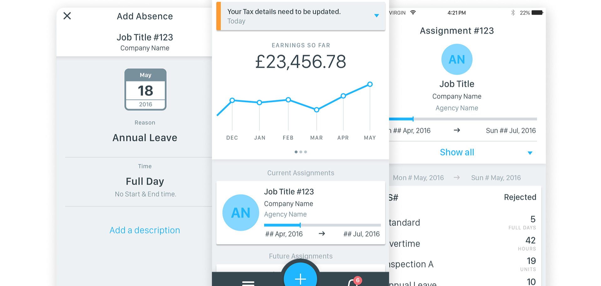
UX and UI design for a fintech mobile app helping recruitment businesses manage contractor payments, timesheets and approvals through connected experiences for candidates and clients.
While working at Rantmedia, I contributed to the design of Sonovate's mobile application, creating connected experiences for both candidates and clients. The platform enables candidates to submit timesheets, expenses and absences, while giving clients a simple way to review and approve requests. My role focused on designing intuitive user journeys, simplifying complex financial workflows and creating polished, easy-to-use interfaces.

The Challenge
Designing for two distinct user groups meant balancing different goals while maintaining a consistent experience across the platform. Candidates needed to quickly submit timesheets, expenses and leave requests, while clients required efficient tools to review, approve and manage those submissions. The challenge was to simplify these workflows without overwhelming users with unnecessary complexity.
My Role
I worked across UX, UI and interaction design, creating user journeys, wireframes and high-fidelity interfaces before collaborating closely with developers throughout implementation. The focus was on creating clear navigation, intuitive interactions and consistent visual patterns across the app.
Designing for Multiple Users
The application supported two connected experiences:
Candidates could submit timesheets, expenses and absences with minimal effort.
Clients could efficiently review, approve and manage submissions.
Although each audience had different needs, maintaining consistency across both products helped create a cohesive user experience.
Design Approach
The interface prioritised clarity, accessibility and ease of use. Careful information hierarchy, simple navigation and consistent interaction patterns helped reduce cognitive load, making financial and administrative tasks feel straightforward.
Candidates often needed to submit timesheets, expenses and absences while away from their desks, so key actions were designed to be quick and easy to access. For clients, the focus was on enabling fast review and approval of submissions, reducing unnecessary steps while maintaining clarity throughout the process.
Reflection
This project strengthened my experience designing fintech products for multiple user groups while balancing business requirements with user needs. Working closely with developers and stakeholders ensured solutions were practical, scalable and ready for implementation.